The Semiotics of CGI: How Visual Cues Influence Product Perception
- Ryan Newfell

- Dec 2, 2025
- 4 min read

Introduction
Semiotics is the study of signs, symbols, and visual cues. It explains how people interpret what they see, not just what they consciously notice. In kitchen and bath marketing, this matters more than most brands realize. Customers aren’t evaluating a faucet or vanity in isolation. They’re responding to the environment, the mood, the lighting, the textures, and the emotional tone of the room around it.
My background in communication and visual strategy has shown me how powerful these cues are. When used intentionally, they shape perception instantly. When used carelessly, they distract or confuse.
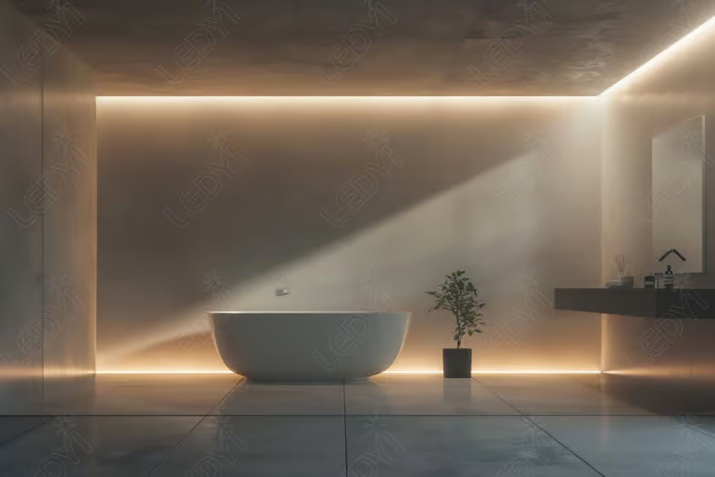
At Brass Bear Studio, semiotics is built into how we design CGI rooms. We use wood, tactile finishes, and balanced textures to create warmth and realism. Our rooms are believable, not just beautiful, and grounded in architecture, light, and craft. Drawing on core principles of visual communication, we build compositions that guide the viewer’s eye naturally to the product. The room supports the design story. The product always stays in focus.
This blog breaks down how semiotics applies to CGI and how the right visual decisions help your products sell.
The Psychology Behind "Seeing" a Product
Customers make decisions quickly. They respond to subconscious cues long before they analyze the product itself. This is why a visually confusing scene can undermine even the best design.
Here are some of the cues they process instantly:
Lighting and color temperature
Camera height and angle
Texture quality and reflectivity
Spatial clarity and room proportion
Color harmonies and contrasts
These cues influence perceived quality, warmth, durability, usability, and brand credibility. If something feels inconsistent or unrealistic, the viewer senses it immediately. They may not know why it feels off, only that it does.
Semiotics helps bridge the gap between showing a product and communicating what it represents.
Light as Language


Light communicates emotion faster than anything else in a CGI room. It shapes how the viewer feels about the product before they even notice the details.
Different lighting signals different meanings:
Natural daylight feels honest, real, and approachable.
Warm interior light creates comfort and intimacy.
Cool light feels technical or engineered.
Overly dramatic light can feel forced or distracting.
Poor or inconsistent light breaks realism entirely.
Lighting should always be intentional. It clarifies the material story, supports the product’s purpose, and reinforces the tone of the brand. We never use lighting as decoration. It is a tool that shapes meaning.
Geometry, Composition & Eye-Flow
Good composition guides the viewer’s eye without them realizing it. This is a core principle of visual communication and a key part of how we design CGI rooms.
A few examples:
Rule of thirds for natural balance
Leading lines created by tile, shadows, or architectural features
Center-of-gravity placement to anchor the scene
Careful spacing to avoid visual clutter
This is why we design rooms around products, not the other way around. The room acts as a framework that supports the hero fixture. Everything from the shape of the vanity to the angle of the countertop works together to bring attention to the main product.
Composition exists to direct attention. The room serves the product.
Texture, Materials & Emotional Interpretation

Texture is one of the most important emotional cues in CGI. It shapes how people interpret quality, craftsmanship, and atmosphere.
Different materials carry different meanings:
Woods signal warmth, honesty, and craft.
Metals suggest precision and engineering.
Stone communicates longevity and luxury.
Balanced textures add richness without overwhelming the product. Too much texture creates noise. Too little texture feels flat or artificial. The sweet spot is where everything looks tactile and believable.
We use wood and tactile finishes to create emotional depth. Texture isn’t just visual. Viewers should feel like they can reach out and touch the materials.
Color Psychology

Color influences emotion immediately. It’s one of the most powerful semiotic tools in design.
Different palettes communicate different ideas:
Warm colors feel inviting and premium.
Cool colors feel modern, minimal, and engineered.
Neutrals feel timeless and editorial.
Finish selection also changes emotional temperature:
Brass adds warmth and approachability.
Polished chrome feels crisp, clean, and high-precision.
Matte black reads bold and contemporary.
Every palette we choose adapts to the brand story behind it. Color isn’t decoration. It is communication.
Semiotics Mistakes Brands Commonly Make


Many CGI issues come from ignoring the semiotic cues that matter most. A few of the most common mistakes include:
Scenes that feel fantastical or architecturally improbable
Backgrounds that compete with the hero product
Overtextured environments that overwhelm the composition
Poor material mapping that creates a plastic or artificial look
Lighting that contradicts the intended mood
Trend-driven design that conflicts with the brand identity
These mistakes disrupt the viewer’s interpretation and create mistrust. When visuals don’t match real-world expectations, the product suffers.
For a deeper dive, I cover many of these issues in my blog 5 Common Mistakes to Avoid When Using CGI for Kitchen and Bath Scenes.
How Brass Bear Studio Applies Semiotics in Practice


Every room at Brass Bear Studio begins with intention.We start with the audience, then the brand, then the product, then the emotion we want to communicate.
The product defines the design, not the reverse. We design CGI rooms that feel structured, refined, and emotionally resonant. Every decision supports the composition and helps the viewer understand the product instinctively.
Our design philosophy:
We use organic woods, tactile finishes, and balanced textures to create warmth, realism, and depth. Our rooms are designed to be believable, not just beautiful, and grounded in architecture, light, and craft. Drawing on fundamentals of visual communication, we build compositions that guide the viewer’s eye naturally to the product. We work across styles, but always with a focus on geometry, texture, and carefully chosen colors. The room serves the product and the product defines the room.
Conclusion
Semiotics is the backbone of powerful CGI. It gives room scenes meaning, depth, and clarity. When used intentionally, it helps your products feel real, desirable, and emotionally resonant.
Thoughtful CGI isn’t about creating someone’s dream home. It’s about creating a room that sells your product.
If you want imagery that communicates as strongly as it looks, we’d be happy to help.


Comments